A few things we’ve been working on...
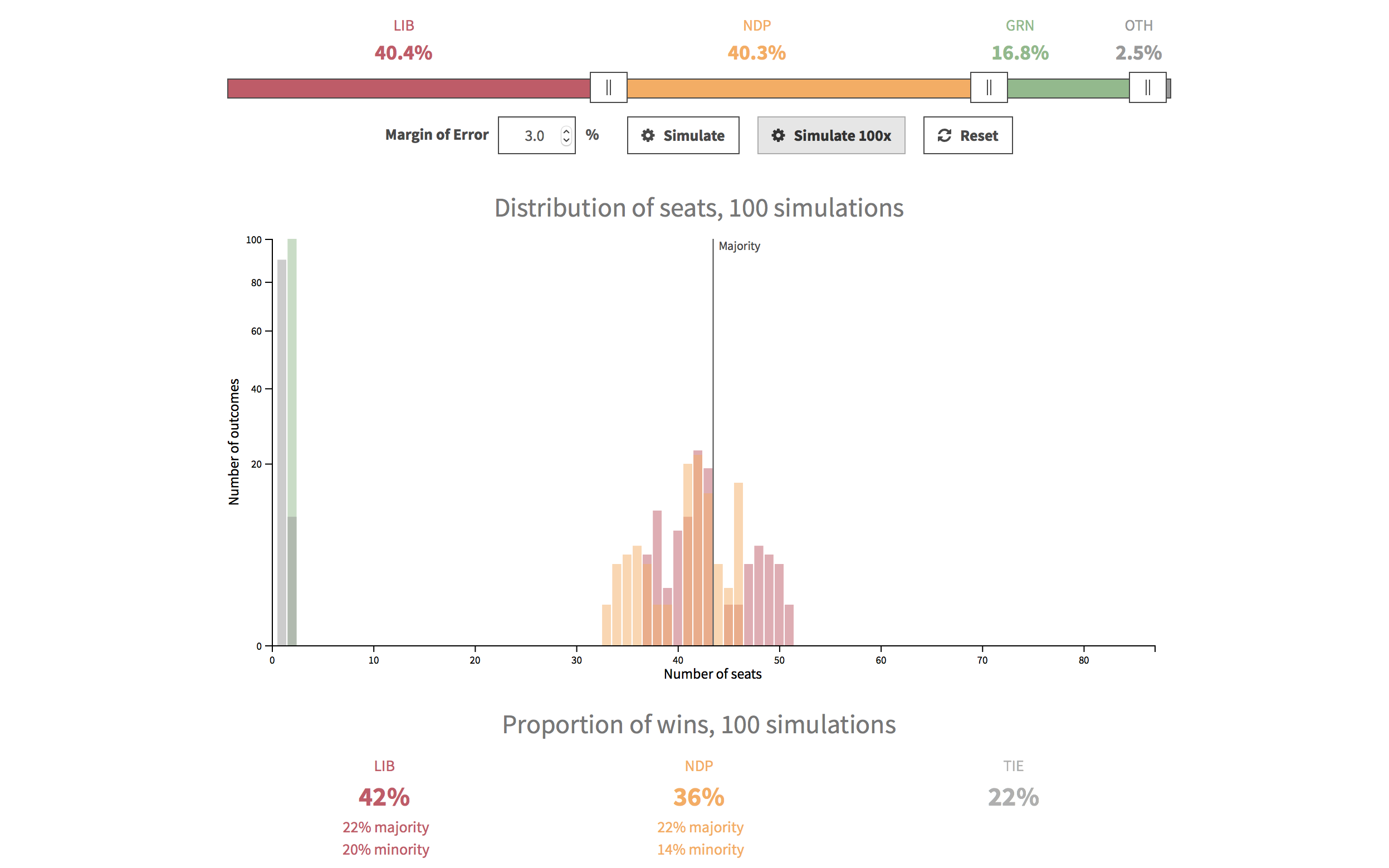
Margins of Error in the BC Election
We built a tool to help visualize margins of error in political polling, using the 2017 BC Election as an example.
Data wrangling Charting Development Visual design
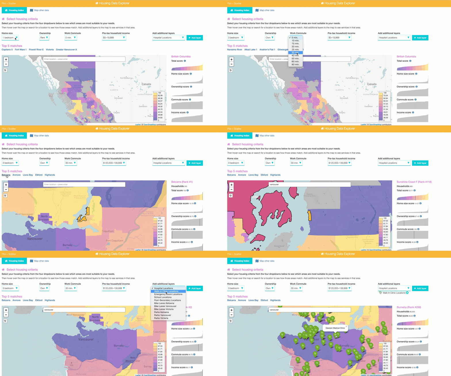
See this projectBCIC Data Visualization Challenge
We were among the top 5 finalists to participate in the BCIC data visualization challenge. This is the prototype we've submitted and will continue to work on over the coming weeks. (More to come on this project soon.)
Data wrangling Mapping Charting Development Visual design
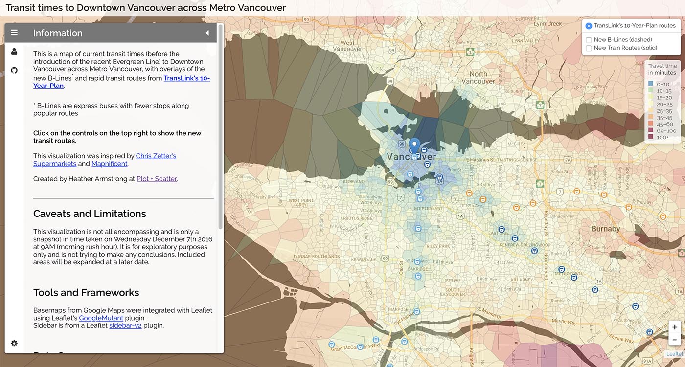
See this projectMetro Vancouver Transit Times
Visually explore how the new rapid transit routes in TransLink’s 10-Year-Plan may address transit times across Metro Vancouver to Downtown Vancouver.
Data wrangling Mapping Development Visual design
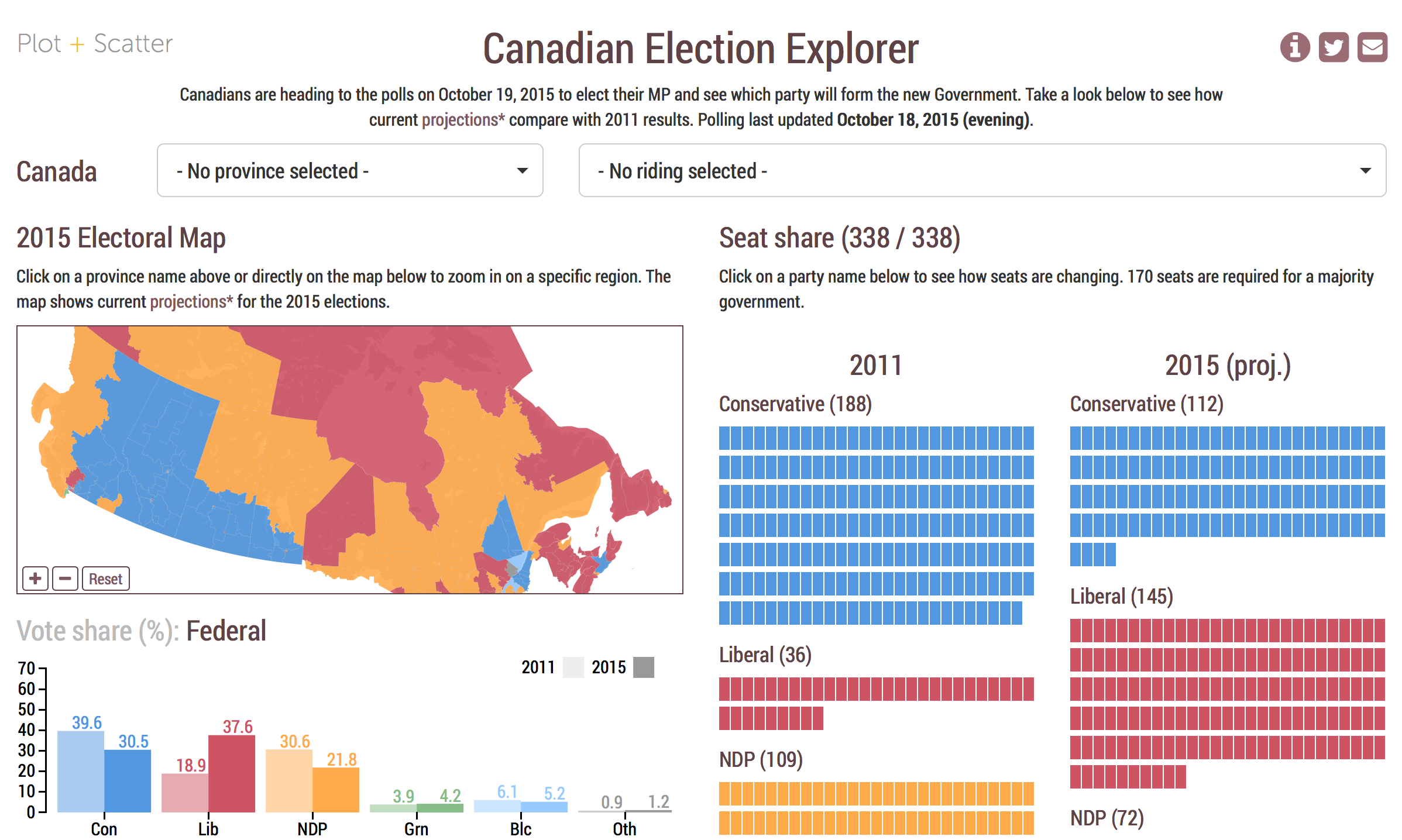
See this projectCanadian Election Explorer
We created the Canadian Election Explorer during the 2015 federal elections to make polling-based predictions easy and fun to understand and explore.
Data wrangling Mapping Charting Development Visual design
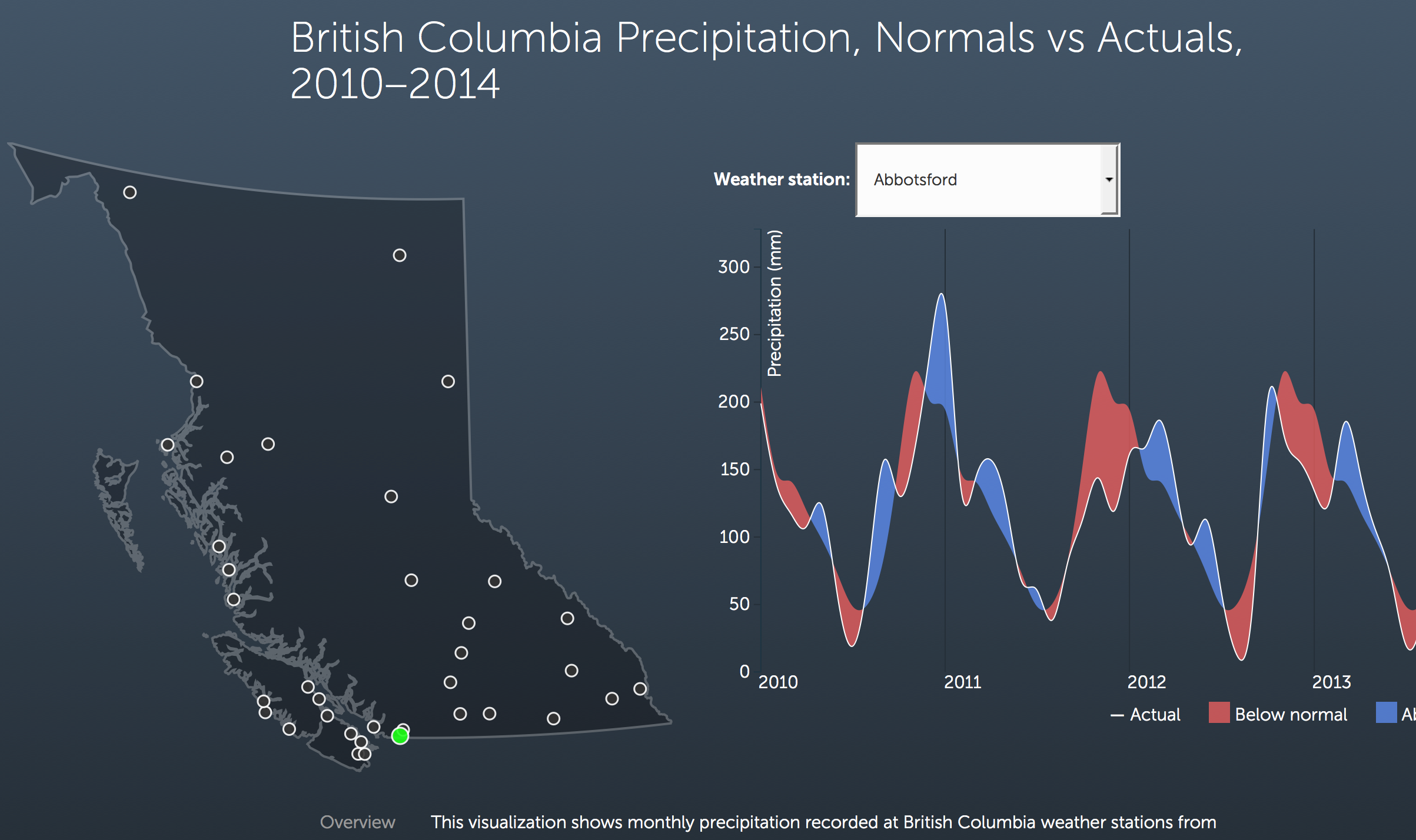
See this projectBritish Columbia Precipitation Map
Find out how monthly precipitation in British Columbia has varied over the last five years. We compare actual precipitation data with historical normal precipitation for weather stations across the province.
Data wrangling Mapping Charting Development Visual design
See this project...and more.
Mobile Broadband Pricing
Think that you're paying too much for your phone data? See where you can buy the cheapest broadband data around the world.
Data wrangling Mapping Charting Development Visual design
See this projectData + Design ebook
Data and Design is an online open source project that has brought together more than 50 volunteer contributors from around the globe, helping designers and people with little data experience create beautiful, yet accurate charts and graphs. Check out our contribution at chapters 3 and 4 of the ebook.
Analysis Writing
See this project