Heather Armstrong did an internship at Plot + Scatter in fall 2016. Here she describes the capstone project she completed as part of a course she did at the Vancouver Institute of Visual Analytics. Heather offers valuable insight into some of the design decisions and challenges she faced when building her project.
Background
I completed the Transit Voronoi Explorer in 2016 for a course I was taking at the Vancouver Institute of Visual Analytics. The aim was to build an interactive map with an overlay of transit times to downtown Vancouver across the Metro Vancouver area. I hoped this could give insight into each neighbourhood’s accessibility to public transport.
I envisioned the tool helping transit planners with the optimization of transit routes. Or assist new home buyers to make informed decisions when deciding where to live. It would specifically help target and minimize last-mile travel times, encouraging increased connectivity to transit across the Lower Mainland.
Initial research
I found the Translink 10-Year-Plan, while doing some initial research. The plan consisted of creating new B-Lines and rapid transit lines, which I later added as an overlay to the map.
I contacted TransLink to inquire about other useful resources they might have. They responded with several links and said a data-driven project could be valuable to help validate the plan. The 10-year plan includes some of the biggest changes ever to be made to Vancouver’s transit routes. And at the time was the only plan based on prior passenger flow data.
1. Data acquisition
After identifying the visualization’s purpose and design, I gathered coordinates for the travel time data. The City of Vancouver had a shapefile which included coordinates of all city street intersection. But I had to contact other cities in the Metro Vancouver area and inquire for similar datasets. Sadly, most didn’t have any available. This highlighted how difficult sourcing data can be.
Being a UBC student was a great help in this case though. I used the university’s GIS database to locate a CanMap Content Suite, and found one that contained a shapefile for every intersection in Canada. I then cropped specific areas and reduced the point density with QGIS. Finally, I had a set of coordinates that I could use to get travel time data. But I now needed to find public transportation data.
Selecting an API to collect data was more complicated than I thought. Many APIs either lacked public transportation data, or weren’t free. I settled on the Google Maps Distance Matrix API for its ease of use.
Google Maps charges a fee though based on the number of data points you collect. The travel time for a coordinate at a given time would be considered one data point. The problem was I could only access 2,500 free data points per day. Since I needed data for about 25,000 coordinates, cost became a limiting factor. I decided to only gather data for a snapshot in time (9AM on a Wednesday morning during rush hour).
2. Visualization tool planning
The next step was to plan the visualization. I had several use cases, some rough UI sketches, and an idea of how I would build my project. Yet, I still needed to select a tool or framework to use. The Google Maps API requires that all data collected be displayed on a Google Map. So I needed a framework with a Google Maps base-map. It had to be flexible enough to create customized SVG overlays. I found that, Leaflet did the job.
3. Building the map visualization
The process of building the visualization was challenging. I had little experience with JavaScript. Having API documentation, tutorials, and visualization examples were key.
Challenge 1: Using Google Maps base map
Leaflet has a plugin section with many different base-map providers. This allows you to use almost any map-tiles with little to no configuration. One plugin allowed you to use Google Maps tiles as a base-map, GoogleMutant. But it had been created only two months earlier. So documentation was limited and the plugin generated many bugs in the project.
I did consider several other options. At the time, Mapbox didn’t provide transit data through their API though. MapZen did, but it required that you to know each location’s stop ID. I finally managed to use GoogleMutant GoogleMutant after some debugging,
Challenge 2: JSON API data post-processing
Once the base-map was running, I need an appropriate way to format the JSON data so that I could create a customized SVG overlay. To do so, I extracted the latitude and longitude coordinates and the travel times from the JSON. I changed all time data to total number of minutes by writing a post-processing script in Python.
Challenge 3: Visualizing point-based time data
I collected point-based time data for the selected intersections within each city. But I needed to visualize the area around each specific coordinate.
The basic SVG-circle
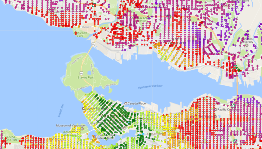
Initially, I used equally-sized SVG circles to test my colour scale before shading the polygons. Each circle represented one coordinate. I shaded them based on their corresponding time interval.
 This helped confirm that my method fulfilled the purpose of my project. It also ensured that I was able to capture areas where it took longer to get downtown via transit.
Moving to a Voronoi diagram
Once I validated the idea, I then had to find a way to create an layer composed of polygons for each point. But I could not use a regular polygon. This was because the coordinates were not evenly distributed. So there would still be spaces between each polygon.
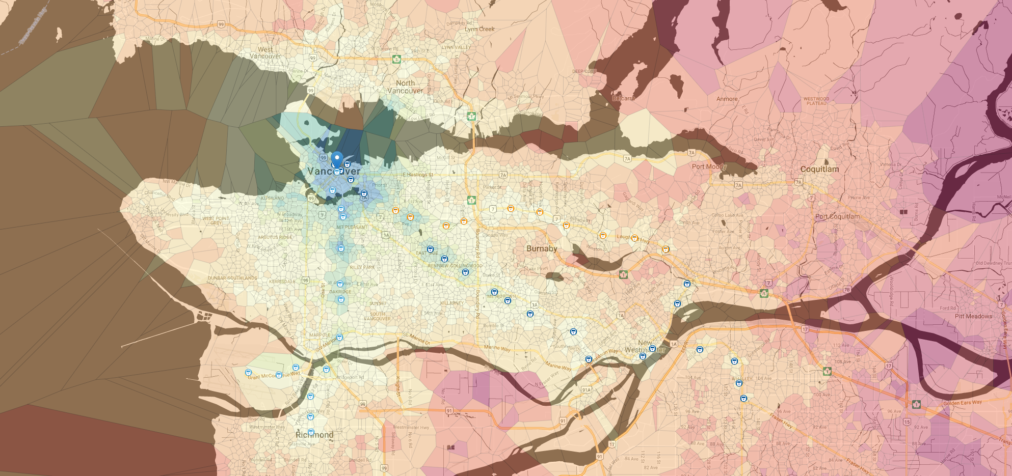
I decided to use a Voronoi diagram instead as an overlay. A Voronoi diagram creates polygons across a plane so that each polygon contains only one point. It maximizes its area without encroaching into another point’s space.
 Leaflet happens to have its own pre-defined function for creating a Voronoi diagram. It’s based on a set of points, but I had having trouble creating one using Leaflet’s
 d3.geom.voronoi() function. So I followed Chris Zetter’s tutorial, which was extremely helpful.
Challenge 4: Speeding up the load time
The original set of coordinates contained a very large number of data points to process every time the map reloaded or moved around. This meant it took a while to redraw the Voronoi diagram each time. To reduce the load time and have a better user experience, I took a random sample of the data using QGIS instead.
This hardly made a difference to the accuracy of the visualization at a high zoom level. But when a user would zoom in too much on the map, the data points no longer gave an accurate representation of travel times.
To to solve this issue, I thought of switching datasets at certain zoom levels. This meant that when a user zoomed in at city block level for example, the Voronoi function would draw the diagram with finer data.
But I was unable to get this aspect of the map working in time for my project, so the map only currently uses the random sample dataset. I am still hoping to implement this functionality at a later date.
Challenge 5: Containing the Voronoi diagram
The Voronoi diagram presented some other challenges. A Voronoi diagram doesn’t have any constrained boundaries. So it will spread outwards infinitely. As a result, the areas of the outer most polygons are infinite. This makes for a messy visualization when a user tries to navigate outside of the main map area.
To ensure the Voronoi diagram was contained, I had to limit the minimum zoom level. I also made the map bounce back to a set of defined bounds when a user tries to drag the map out too far.
Challenge 6: Creating a colour scale that shows the differences in travel time
Creating a colour scale that allowed users to see both small and big differences in travel time was difficult. I couldn’t just use a linear scale.
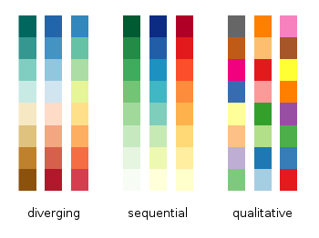
 Image: Gnuplotting
First, I tried using a single-hue sequential scale. But it was hard to distinguish accessible areas from remote ones. The diverging scale made it somewhat easier to identify areas that lacked transit access.
The travel times started at 0 minutes and went all the way to over 200 minutes. To capture this range of time, I varied the intervals. The time scale started with at 5 minutes, and went up to 40 minutes. Times increased in a logarithmic-like manner.
Challenge 7: Integrating TransLink’s 10-Year-Plan
The last challenge was to see how well the new planned routes targeted underserved areas. I thought to overlay the routes on top of the Voronoi diagram. This proved to be more tedious than difficult.
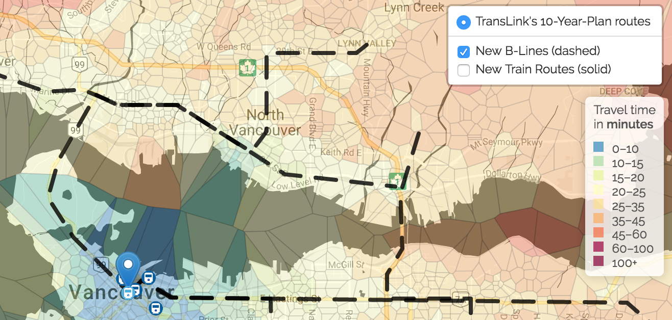
I ended up creating a new overlay on the map, and plotted the planned B-Lines and rapid transit routes by hand. I then used SVG polylines to create paths out of them. This layer allowed users to see how the new routes would improve travel commute to downtown Vancouver.
Results
Overall, the completed visualization met my goals.I noticed that most skytrain stations were surrounded by a blue or green polygon. This indicates faster transit times to get downtown. Stations farther out will have a different colour polygon as travel time increases. This make intuitive sense.
The focus on increasing flow in more highly traveled corridors becomes obvious when the new B-lines and new train routes are layered on the map. Translink seems to be addressing the high flow of traffic to universities, by implementing new B-Lines to both SFU and UBC.
The 10 year plan also includes a new rapid transit route which connects VCC-Clark to the Arbutus and Broadway areas. Surrey, Langley, and Coquitlam all gain rapid transit routes as well. This increases the ease of commuting to downtown Vancouver.
Parts of New Westminster, Richmond, Port Coquitlam, and White Rock do not seem to benefit from new transit routes though. The center of each municipality appears to be well connected, but most people do not live there.
The lack of transit connections to outskirt neighbourhoods increases last-mile travel times, or people’s commute times to downtown Vancouver. Unfortunately, the data and map don’t capture population distribution in these areas. This may be a factor for not developing transit routes in these areas.
Limitations
This visualization has several limitations. I have outlined them throughout this text, but to summarize:
- The data visualized is only a snap shot in time at 9AM rush hour on a Wednesday morning. It is likely that the Voronoi overlay would change depending on the day of week and time of day. (I realized afterwards that 9am might even be too late to capture the morning rush.)
- The data used is currently a random sample, hence accuracy decreases as a user zooms in on the map.
- There are still several areas to add in Metro Vancouver (e.g. Maple Ridge and Langley).
- The map doesn’t capture the number of people traveling to and from places. Nor does it show which are the most popular routes and stops.
Future improvements
A few improvements could be made for a more in-depth and accurate analysis of the TransLink plan. Some are more feasible than others:
- Create another layer to highlight inaccessible areas that need to be addressed.
- Increase point density and accuracy as the user zooms in.
- Visualize data from different times and days of the week.
- Add all municipalities in the Metro Vancouver area.
- Show the movement of people to and from downtown Vancouver, as well as most popular routes.
- Be able to change destination points.
Still, this visualization is a good initial step. A bigger project in the future could include other features and aspects of the transit plan.
